The View Variety

Alrighty! We've completed the ETL leg of our journey, and now have our data locked and loaded in our OLAP workspace. But the road doesn't end there. Just like a beautiful sculpture hidden under wraps, your data's true potential remains concealed until you bring it to life through the power of visualization! Today, we're exploring the diverse visualization options available within standard OLAP workspaces, empowering you to unlock the hidden narratives within your data and transform raw information into actionable insights.
Gantt
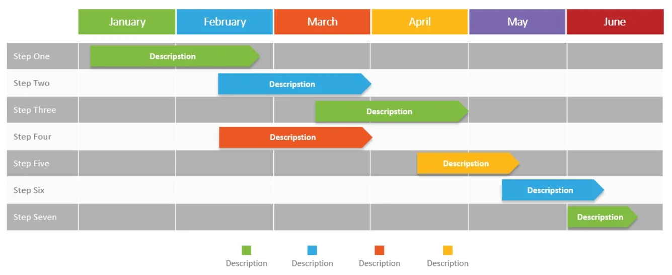
Gantt View emerges as the frontrunner when data is derived of projects, tasks, and schedules. It illustrates a bird's-eye viewpoint of your project timeline, depicting all consequential tasks in horizontal installments. Complex dependencies between tasks are elegantly and clearly illustrated through connection lines, ensuring a comprehensive "web" is offered - depicting the intricate threads of activity interplay. Progress indicators within the visualizer itself enhance the big-picture framing Gantt strives to achieve, all working in concert to find new sophisticated insights.
List
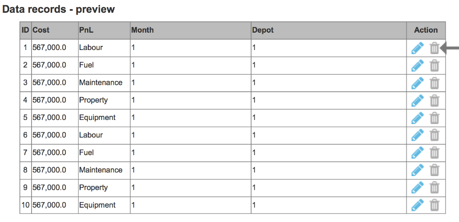
For data that thrives on structure and detail, the List View provides a familiar and efficient representation. Resembling a spreadsheet, the list view organizes your data into neat rows and columns, allowing for easy scanning and comparison across different data points. With the added power of sorting, filtering, and grouping, you can effortlessly sift through vast amounts of information and pinpoint the specific insights you seek.
Dashboard
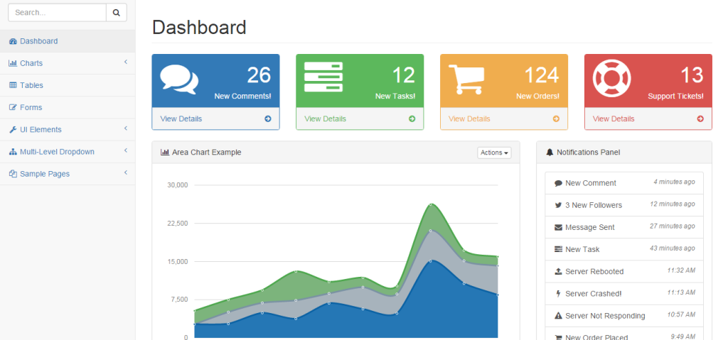
When a high-level perspective is paramount, the Dashboard View comes to the rescue. Think of it as your data's command center, presenting a curated collection of key performance indicators (KPIs) and metrics through an engaging combination of charts, graphs, and gauges. Dashboards are not static entities; they offer customizable layouts and interactive elements, inviting you to explore your data dynamically. Drill-down capabilities further empower you to delve deeper into specific areas of interest, revealing the granular details behind the overarching trends.
Table
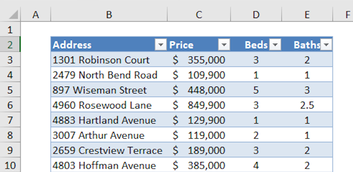
For deep dives into your data's intricate details, the Table View stands as your trusted companion. This visualization embraces complexity, accommodating a wide range of data structures, hierarchies, and aggregations. It serves as your analytical canvas, allowing you to slice and dice your data through filtering and sorting, uncovering hidden patterns and anomalies that might otherwise remain obscured.
Chart
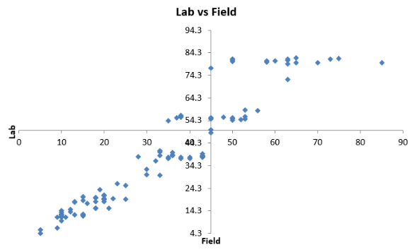
Char Views are the versatile workhorses of data visualization, transforming numerical data into compelling visual narratives. Whether you need to compare values across categories with a bar chart, track trends over time with a line chart, or understand proportions with a pie chart, the chart family has a solution for your every need. Scatter plots, area charts, bubble charts, heatmaps, and treemaps further expand your visualization toolkit, allowing you to explore relationships, distributions, and hierarchies within your data.
Map
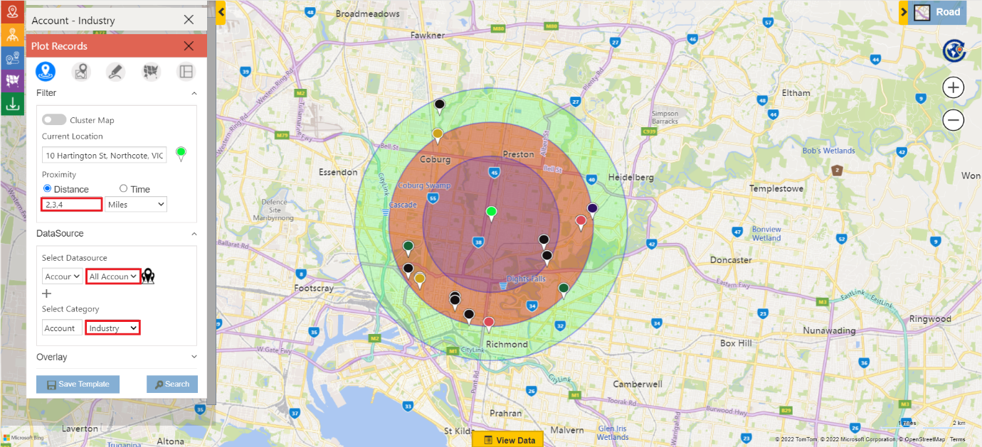
When location plays a pivotal role in your data, the Map View steps into the spotlight. This visualization brings your data to life geographically, plotting data points on a map and using markers, colors, or heatmaps to represent their values. Map views are invaluable for identifying spatial patterns, understanding regional variations, and exploring geographical trends within your data.
Calendar
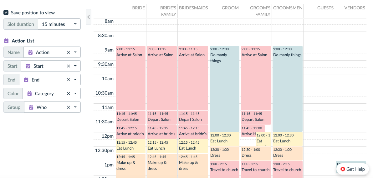
For data with a predominantly temporal component, the Calendar View offers a natural and intuitive representation. Events, appointments, deadlines, and recurring activities are seamlessly displayed within a familiar calendar format, revealing time-based patterns and schedules that might otherwise be missed.
Timeline
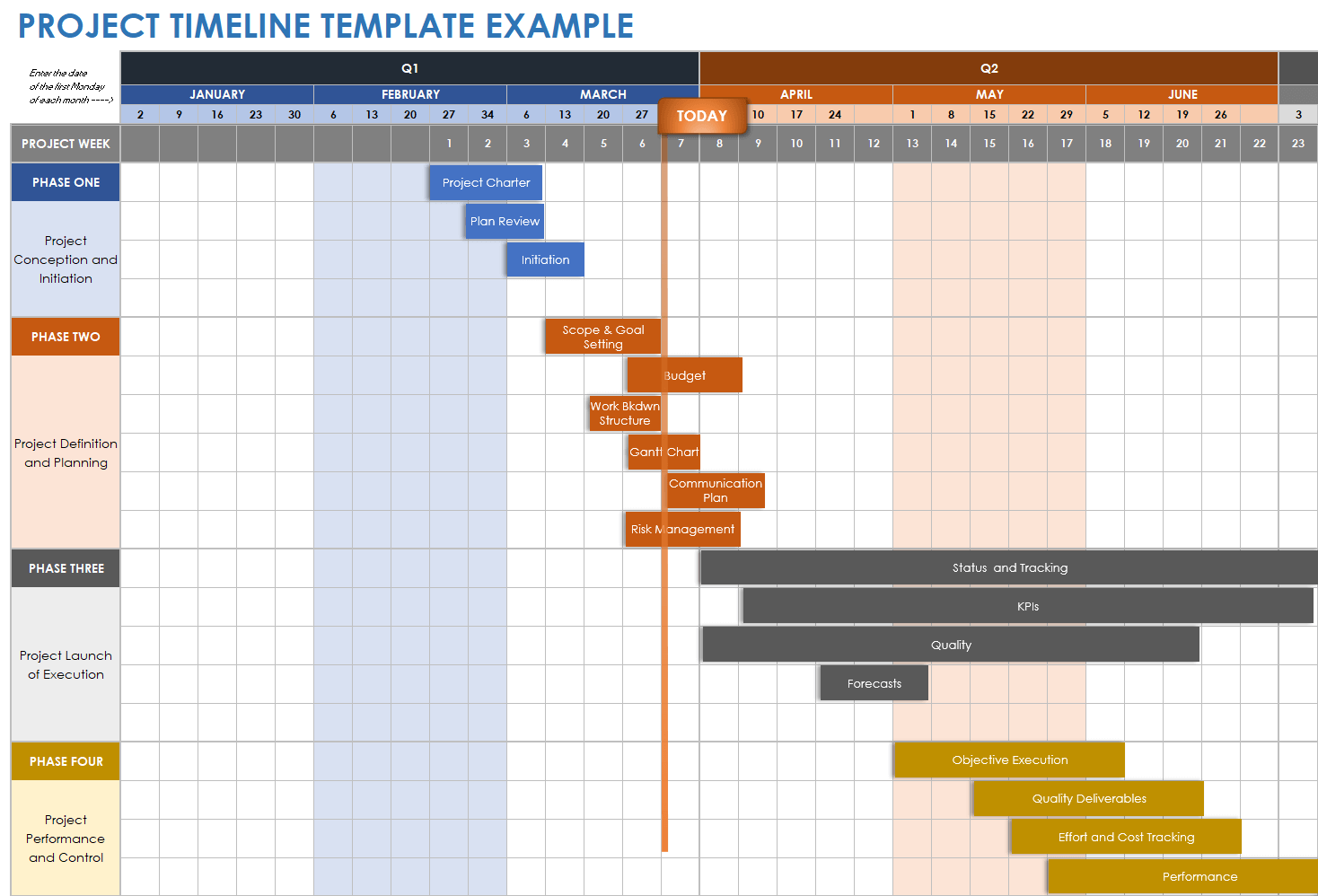
When understanding the chronological sequence of events is crucial, the Timeline View comes to the forefront. This visualization meticulously arranges events along a chronological axis, highlighting their duration and revealing the unfolding narrative of your data over time. Timelines are powerful tools for historical analysis, project tracking, and understanding the evolution of trends.
Network
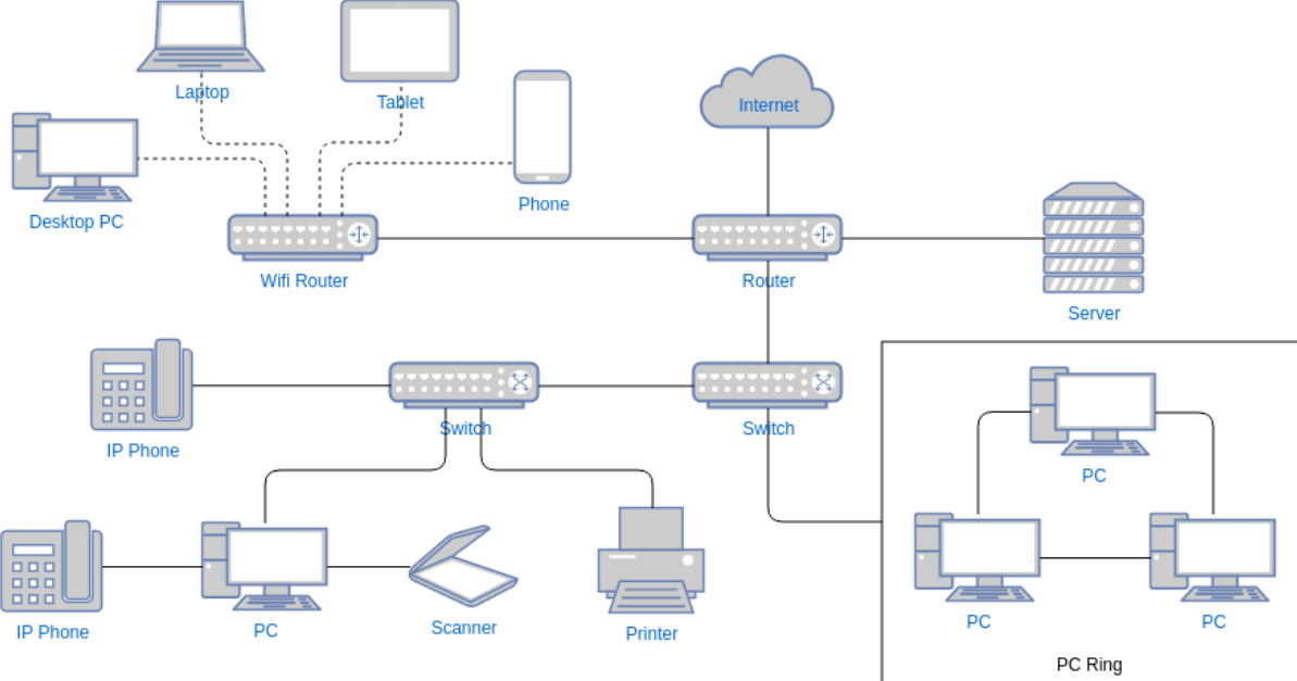
When your data revolves around relationships and connections, the Network View steps in to illuminate the intricate web of interactions. Entities are represented as nodes, and their relationships are depicted as links, creating a visual representation of complex networks. Network Views are invaluable for understanding social structures, supply chains, dependencies, and the flow of information within your data.
Hierarchy
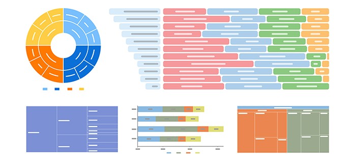
For data that naturally falls into hierarchical structures, the Hierarchy View provides a clear and organized visualization. Parent-child relationships are elegantly displayed, revealing the multi-layered structure of your data, whether it's an organizational chart, product categories, or any data with inherent hierarchical levels.
| Cobi Tadros is a Business Analyst & Azure Certified Administrator with The Training Boss. Cobi possesses his Masters in Business Administration from the University of Central Florida, and his Bachelors in Music from the New England Conservatory of Music. Cobi is certified on Microsoft Power BI and Microsoft SQL Server, with ongoing training on Python and cloud database tools. Cobi is also a passionate, professionally-trained opera singer, and occasionally engages in musical events with the local Orlando community. His passion for writing and the humanities brings an artistic flair with him to all his work! |
Tags:
- AI (4)
- ASP.NET Core (3)
- Azure (13)
- Conference (3)
- Consulting (2)
- cookies (1)
- CreateStudio (5)
- creative (1)
- CRMs (4)
- Data Analytics (3)
- Databricks (1)
- Event (1)
- Fun (2)
- GenerativeAI (4)
- Github (1)
- Markup (1)
- Microsoft (13)
- Microsoft Fabric (2)
- NextJS (1)
- Proven Alliance (1)
- Python (6)
- Sales (5)
- Sitefinity (13)
- Snowflake (1)
- Social Networking (1)
- SQL (2)
- Teams (1)
- Training (2)
- Word Press (1)
- Znode (1)
Playlist for Sitefinity on YouTube
Playlist for Microsoft Fabric on YouTube
Playlist for AI on YouTube
Copyright © 2025 The Training Boss LLC
Developed with Sitefinity 15.3.8500 on ASP.NET 9

